Quality Test Analytics
Sealights is all about collecting tests data and analyzing it. Since its beginning in August 2015, Sealights has collected an ocean of data about its clients tests and displayed raw data in its dashboard, allowing the customer to inspect it and gain insights.
Early in 2018, Sealights have started to analyze this data manually and communicate it to its clients using accounts managers. Our next phase was to generate automated reports and insights to be used by R&D Team Leaders and R&D Managers.
Disclaimer: all information in this case study is my own and does not necessarily reflect the views of Sealights.
The Challenge
Show to R&D Managers and Team Leaders the quality of their components and highlight those which improved and those which deteriorated.
The real challenge is to show the same data where each persona needs a slightly different view that will enable him to take meaningful decisions and action items.
Main Goals
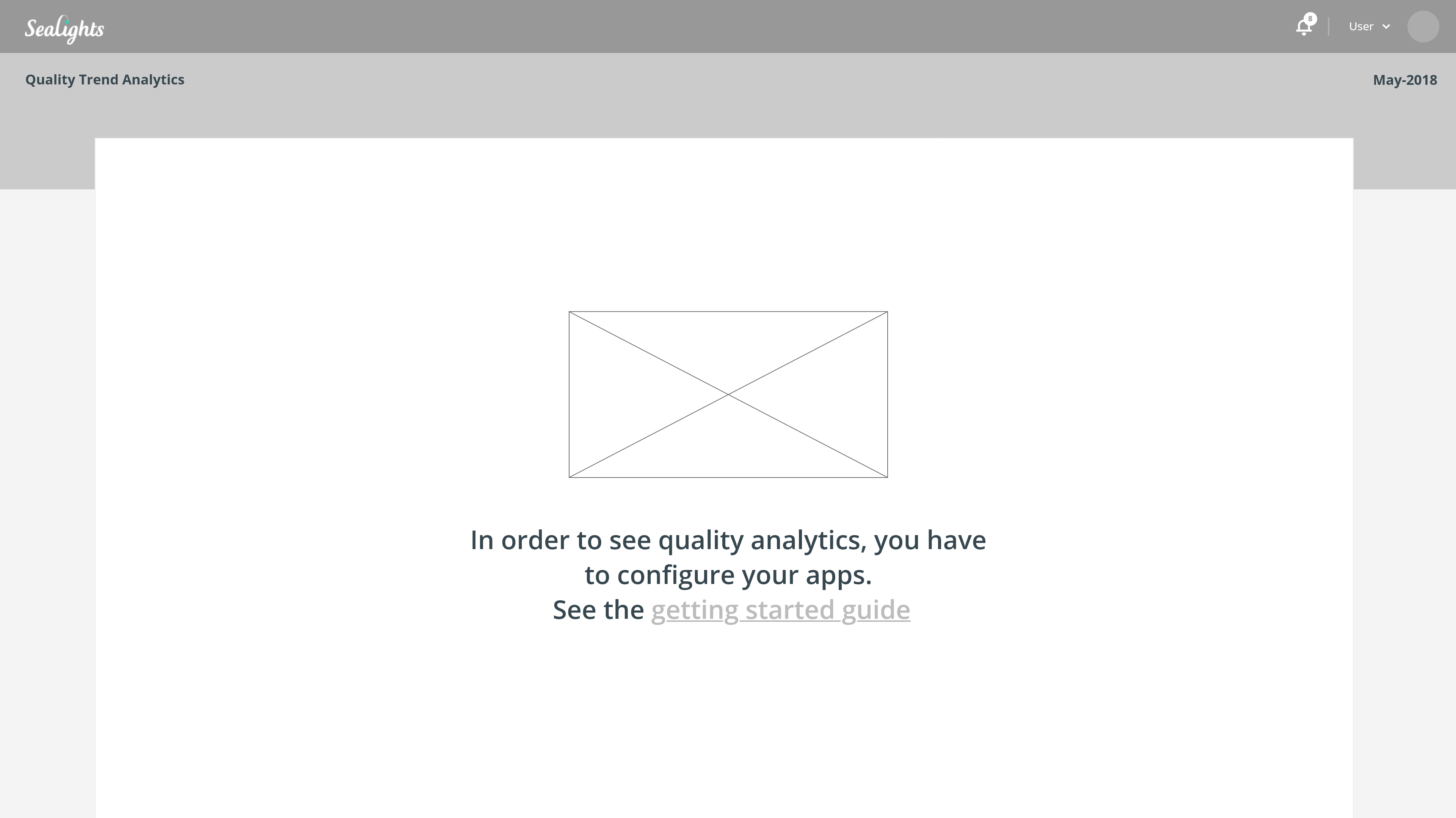
Currently, none of our personas has the visibility regarding the Quality, Development Velocity and Test Activity of their team/group.
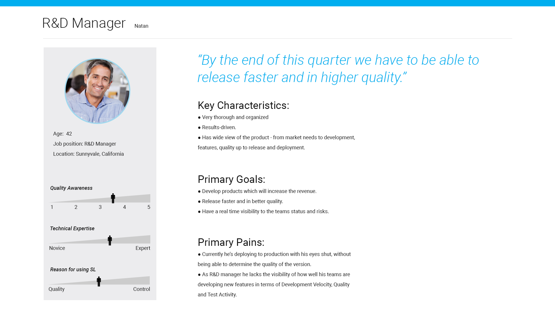
R&D Manager should get a quick view about the components he owns, allowing him to dispatch work to his team leaders. Since he's always in a hurry, the data should be accessible and easy to scan.
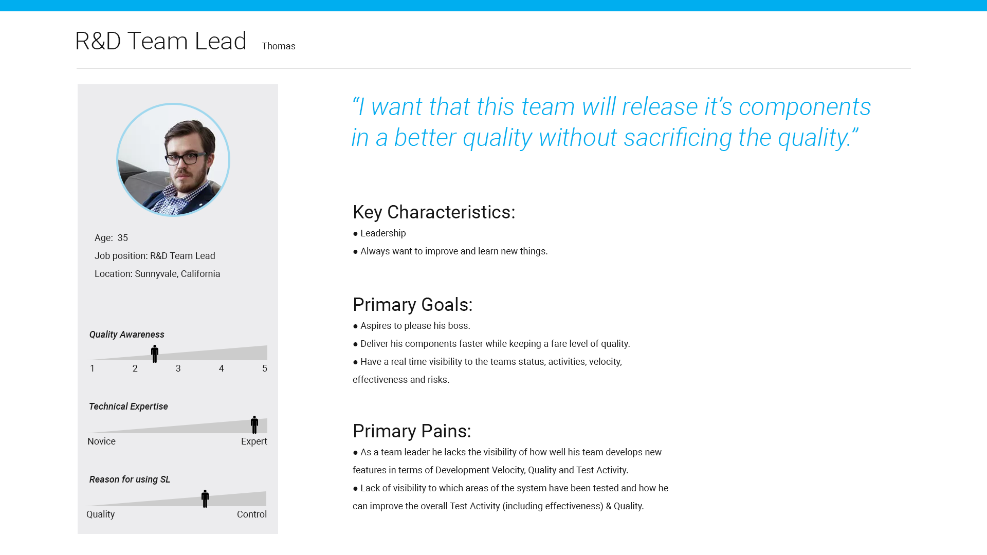
A Team Lead should get insights about his quality & development and testing efforts, allowing him to take actual steps quickly, without having to analyze the data manually and from multiple sources.
The Solution
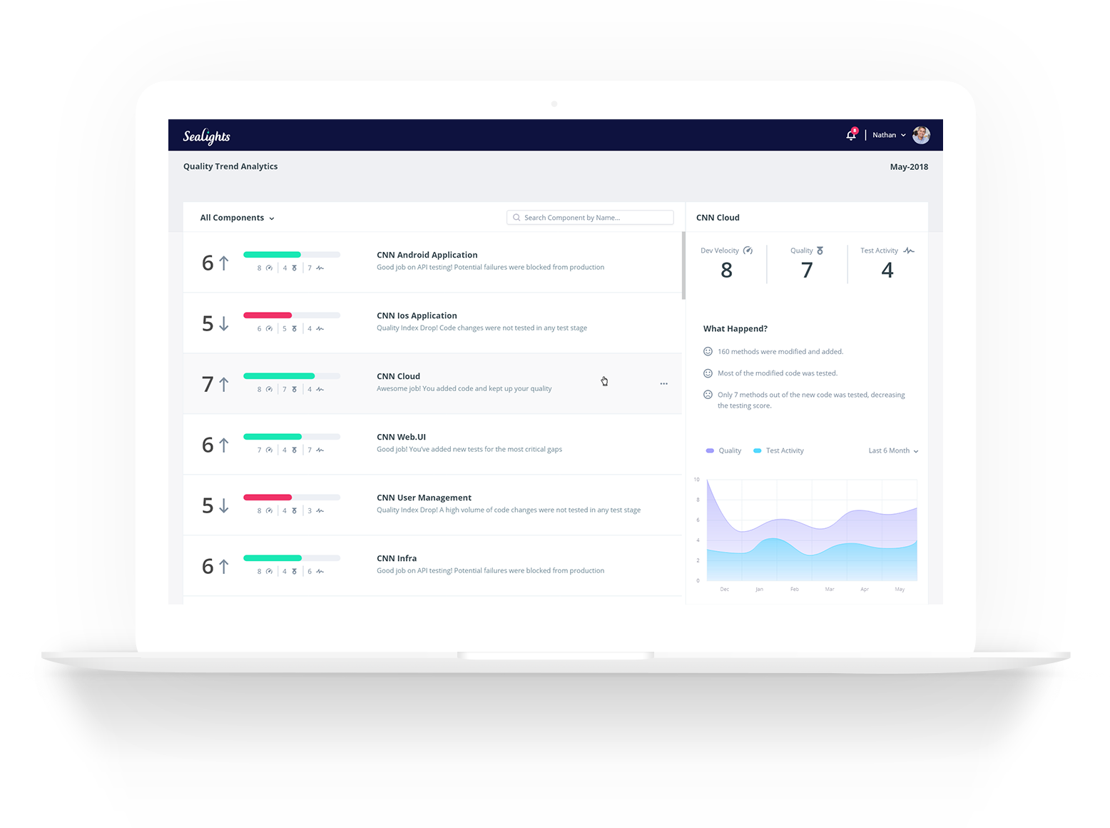
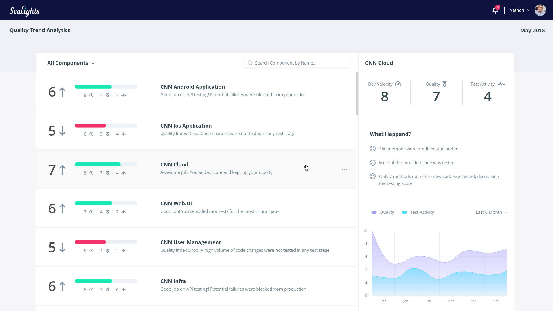
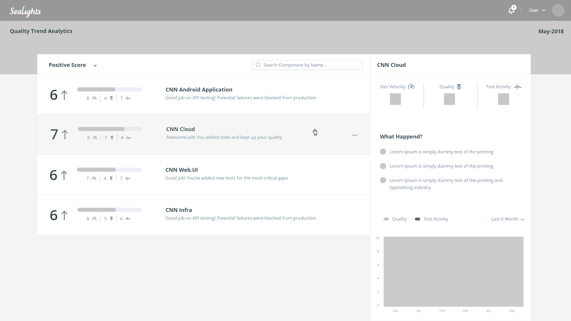
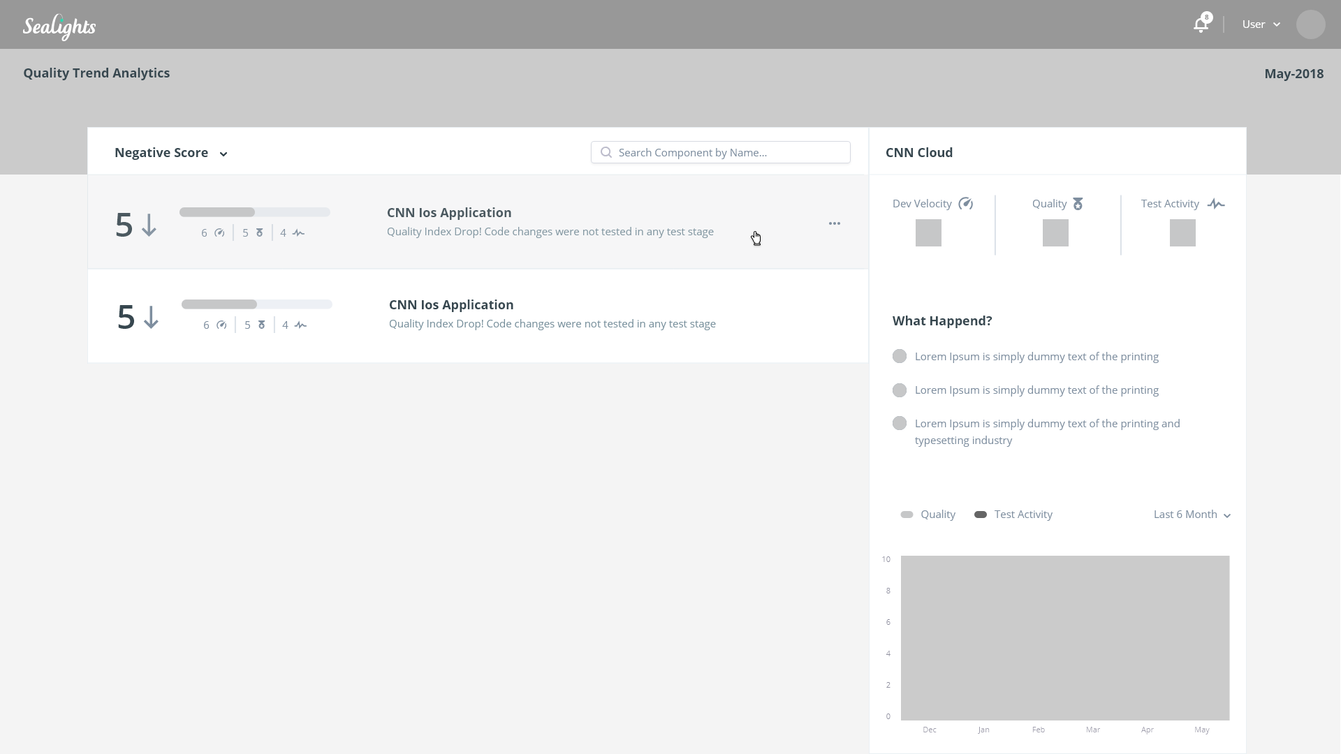
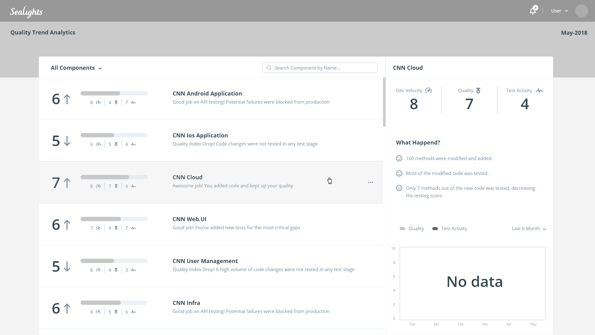
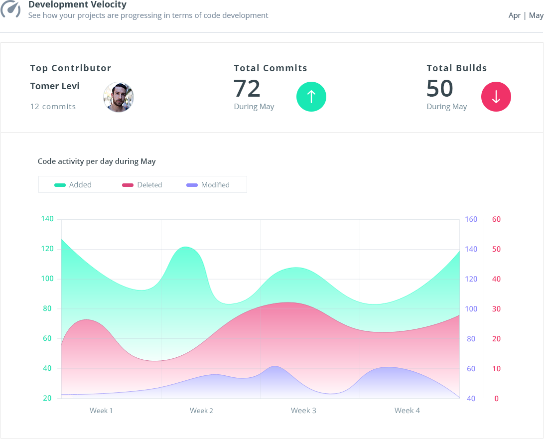
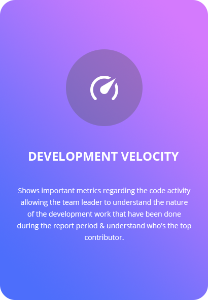
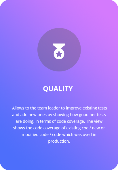
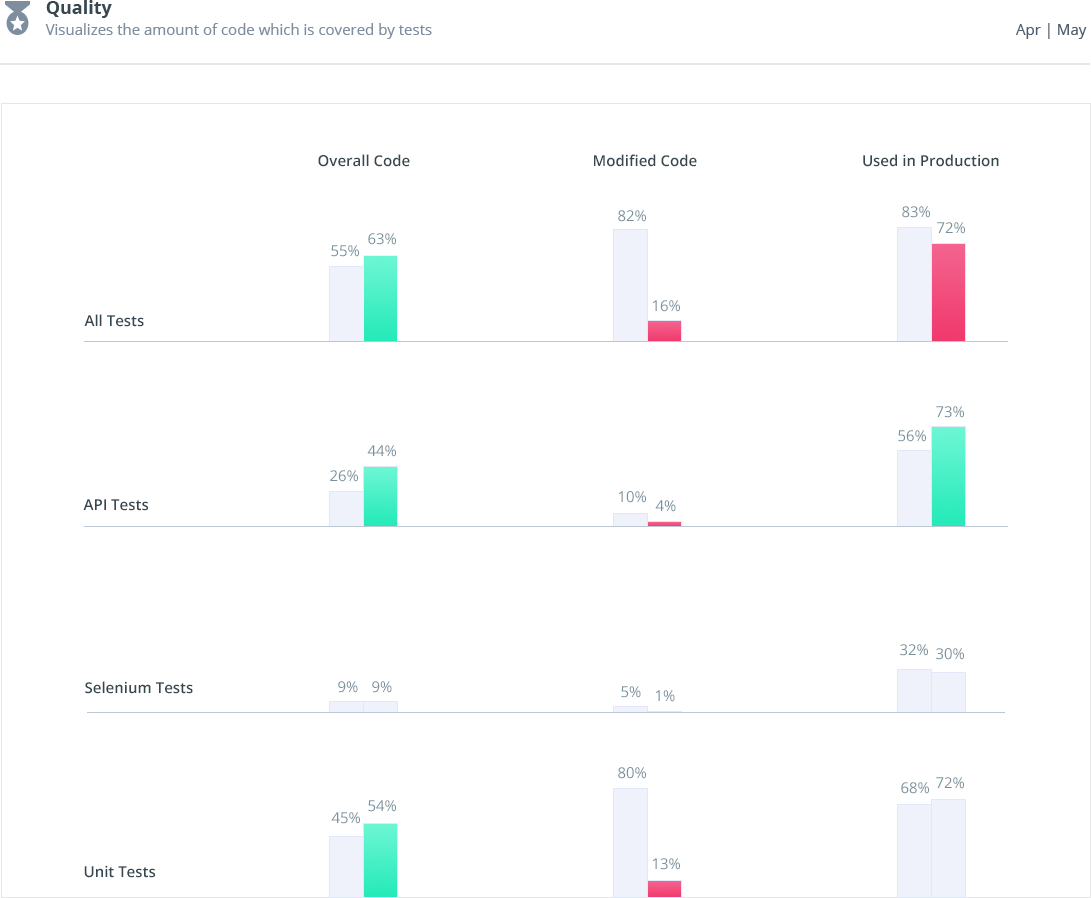
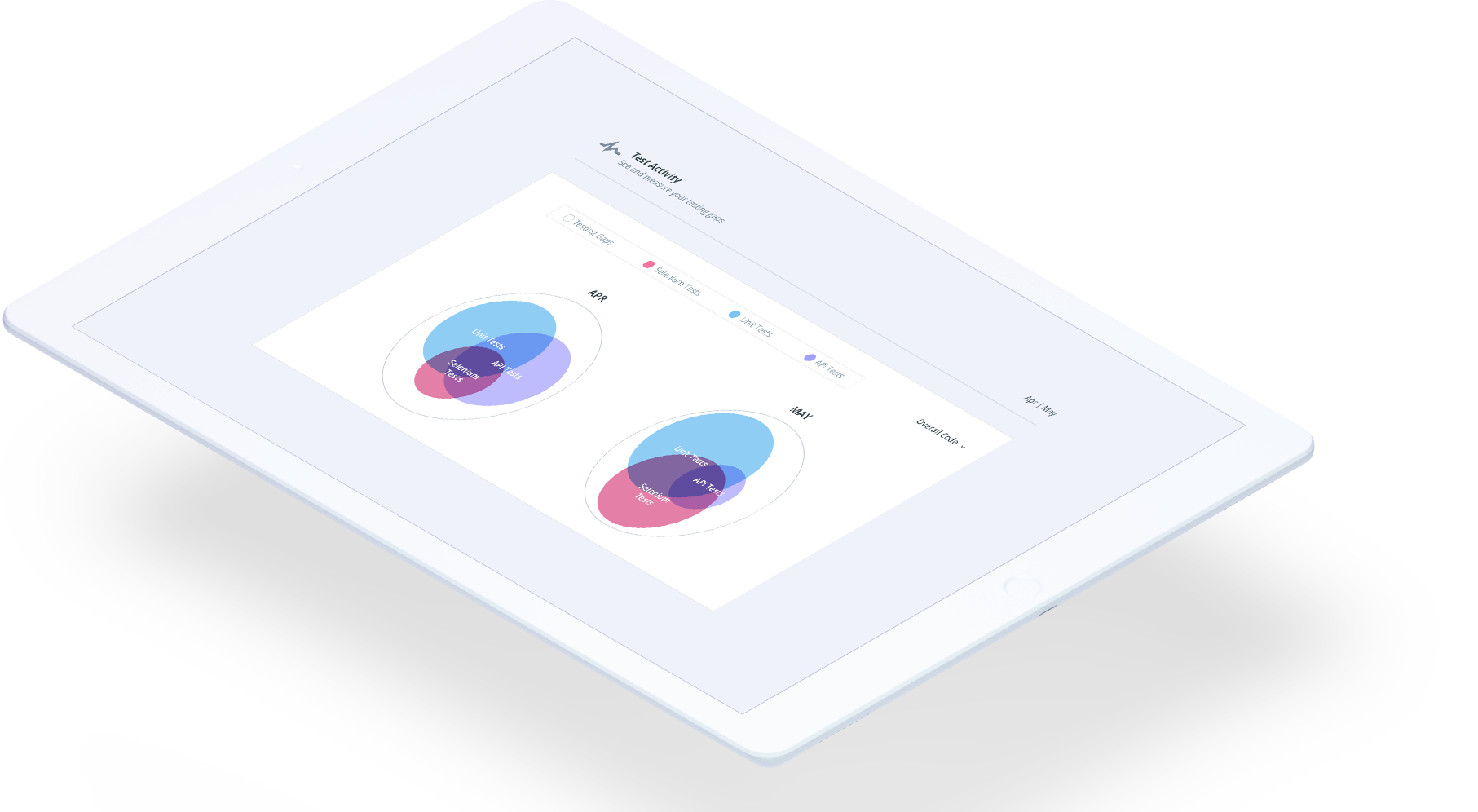
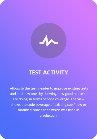
The solution was to create a new metric called the Sealights Index which is comprised of three scores: Development Velocity, Quality and Test Activity.
Since we have two different persons with different needs, we have created a high level view for the R&D Manager and a more detailed view for the Team Leader.
R&D Manager View
Quickly shows to the R&D Manager an overview of the components, allowing him to filter components by activity score and focus on a specific component. This allow him to see the highlights of the component and some historical information in order to see the bigger picture in a matter of seconds.
Final Prototypes
As part of the solution, we had to make sure that we are designing interfaces that will bring value to our end users. In order to create a mutual language with them, we have created a set of prototypes that will visualize our ideas and will help us to discuss about the solution. Below you can see some of the prototypes that we've created for this view.

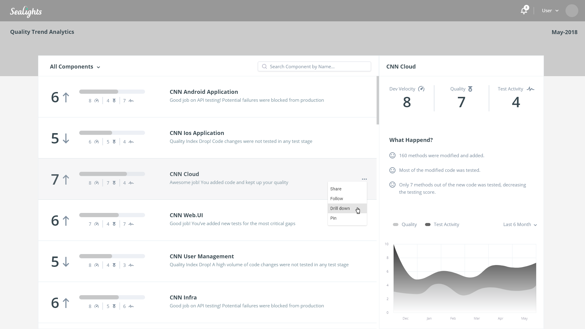
Team Leader View
Allows for a team leader to see an overall score and insights for a component & understand how his team is doing in terms of Development Velocity, Quality and Test Activity.
Thoughts for the next version
The current solution is indeed showing the relevant data & insights to our customers. Since we would like to encourage our customers to use the product and do something meaningful with the data, I think that the next big thing is that we'll be able to collaborate on it, meaning:
- Watch and comment on a specific report
- Tag other developers to get their attention or opinion
- Open Jira Ticket, allowing the developers to create work items
All of those features will allow our users to use the system end-to-end: from the initial data collection through insights and action items.